Before filming it was important to analyse As a pair, Sam and I have done many previous productions together. Most notably our AS film 'Downfall'. This was the story of a wealthy man living in central London who loses everything.
Here is a link to our opening sequence and teaser trailer on another blog:
http://samrichardsa2mediablog4173.blogspot.co.uk/2013/11/sam-richards-and-charlie-palmer-cogan.html
Looking back, I think that we relied far to heavily on the Mise En Scen in this production, and therefor the characterisation was not as strong as we would have liked. We also had a lack of establishing shots, something that we will be careful not to miss out in 'Plus One', our current production. On the other hand we have lots of good time lapse shots of famous london landmarks, such as the houses of parliament and the London Eye that can be re-used. Saving us valuable time when we begin our final filing.
Friday, 31 January 2014
Magazine Final
Our final magazine cover contains, the main character at the centre of the page, the rules of thirds has been implemented to ensure the poster is balanced and all parts are proportionate. We also moved some of the side features so that they were not in the characters eye line. By opting for a simplistic background, we can be sure that no focus will be drawn from the main image and Title of the Film or Magazine. I feel this magazine cover fits well to the conventions of Romantic Comedy film magazine cover.
Poster Final
Our final poster was heavily influenced by other Rom/Com posters. I feel that we took the simplicity and added to it, without it becoming over crowded. I feel that this poster communicates the themes of our film well. The older brother is clearly better groomed more confident in his posture. We also took a romantic twist with the 'London a Night' Mise En Scen.
Poster.
We have taken inspiration from other Rom/Com posters. Such as 'There's something about Mary' and also 'Love actually'. From these it was possible to deduce the themes that regularly occur in Rom/Com posters.
This poster contains images of several characters, in a present. It is therefor not typical of a Rom/Com poster as it is also seeking to show other themes within the film, and perhaps to appeal to the 'seasonal' audience rather than just those interested in romantic comedies. It also contains credits and also the names of actors along the top. giving the audience as much information about the film as possible.
This poster is more more simplistic, it is very well suited to a romantic comedy as it shows a 'giggly' looking Cameron Diaz (romance) and also a dog in a full-body cast (comedy). The simplicity is also genre reflective in the way that the films should be easy to digest, therefor making it an easy and thought free process for the viewer.
Wednesday, 29 January 2014
Poster update.
Our poster was a simplistic image of the main character with a back ground made up of several girls, showing his promiscuous ways, this linked strongly to the 'There's something about Mary' poster. Although simple and effective we liked the more intense look of the of the 'Love Actually' poster and decided to make a U-turn decision and opt for a more intricate poster.
Tuesday, 28 January 2014
Update on the cover.
After realising that the EMPIRE logo was both inconsistent and very hard to photoshop. We decided to look for inspiration from other film magazines. One of which was 'Total Film'. We found that whilst the conventions of this magazine were similar to Empire the cover was more erratic and had a lot more going on. This will result in us needing to to add more text to to cover, an idea we have thought of is to use the themes of other classmates films in these.
Friday, 24 January 2014
Magazine Cover.
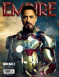
For the magazine cover we will be taking inspiration from EMPIRE film magazine. This is a British film magazine which is owned by a cinema company, which means whilst it often shows the blockbusters, it will sometimes also have a underlying bias towards the British Film industry as most of its journalists and editors are, of course, British. I will try to replicate our magazine from several examples of their covers.
I have photoshopped out the Empire logo onto a transparent background so that we can place it onto our cover when we have it finished. Here are some inspirations that we took from previous empire covers.
I have photoshopped out the Empire logo onto a transparent background so that we can place it onto our cover when we have it finished. Here are some inspirations that we took from previous empire covers.
British/American ROM/COM.
Colours are bright and fun-looking.
Minimalistic blockbuster cover.
The film is already well known so it is not necessary to add lots of information, whilst these covers are a personal favourite, I don't it would work for our film.
Independent film cover, these contain a lot more information about the film as it is probably not well known. Therefor a mix between this and the first one would be ideal for our film.
Subscribe to:
Comments (Atom)


